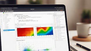
Heat Maps
Heat Maps are graphical representations of data that use color-coded systems to visualize complex data sets or indicate varying degrees of a particular phenomenon. Coursera's Heat Maps skill catalogue teaches you how to create, interpret, and apply heat maps in different contexts like business analytics, website tracking, and geographical data analysis. You'll learn about the underlying principles of data visualization, the process of creating heat maps using different software tools, interpreting heat maps, and understanding their real-world applications in various industries such as marketing, healthcare, and urban planning. This skill enhances your ability to communicate complex data effectively, aiding in data-driven decision making.
8credentials
23courses
Most popular
 Status: Free TrialFree TrialU
University of California, Davis
Specialization
 Status: Free TrialFree TrialU
University of California, Davis
Course
 Status: Free TrialFree TrialT
Tableau Learning Partner
Course
 Status: Free TrialFree TrialU
University of California, Irvine
Specialization
Trending now
 Status: Free TrialFree Trial
Course
 Status: Free TrialFree TrialU
University of California, Davis
Specialization
 Status: Free TrialFree TrialD
DeepLearning.AI
Specialization
 Status: Free TrialFree TrialÉ
École Polytechnique Fédérale de Lausanne
Specialization
New releases
 Status: Free TrialFree TrialU
University of Pittsburgh
Build toward a degree
Specialization
 Status: Free TrialFree TrialU
University of Pittsburgh
Build toward a degree
Course
 Status: Free TrialFree Trial
Course
 Status: PreviewPreview
Filter by
SubjectRequired *
Required
*LanguageRequired *
Required
*The language used throughout the course, in both instruction and assessments.
Learning ProductRequired *
Required
*Build job-relevant skills in under 2 hours with hands-on tutorials.
Learn from top instructors with graded assignments, videos, and discussion forums.
Get in-depth knowledge of a subject by completing a series of courses and projects.
LevelRequired *
Required
*DurationRequired *
Required
*SubtitlesRequired *
Required
*EducatorRequired *
Required
*Results for "heat maps"
Sort by: Best Match


